THE STORY
Barbara came to me with a vibrant vision: a complete rebranding for the 15th anniversary of Viva Frida, her beloved concept store in Lausanne. Rooted in Mexican folk heritage yet looking boldly to the future, Viva Frida needed a new identity—one that honored its artisanal soul while embracing inclusive luxury, storytelling, and emotion. Together, we set out to create a brand universe that would reflect the spirit of the femme chic indépendante: free, strong, and unique.
THE PROJECT
+ Brand Strategy & Positioning
+ Visual Identity Design
+ Art Direction
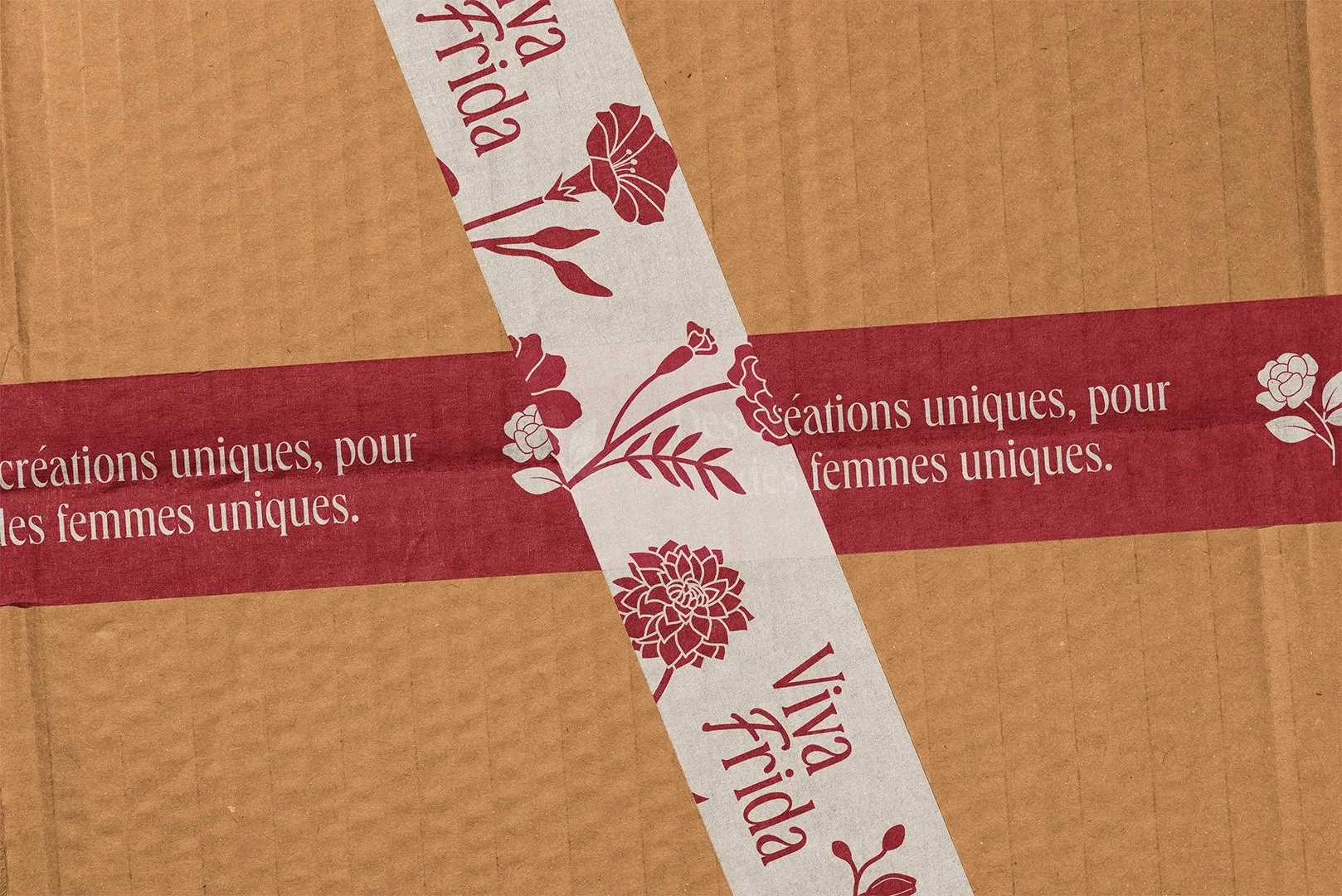
+ Packaging Design (Boxes, Pouches, Stickers, Tape, Tissue Paper, etc.)
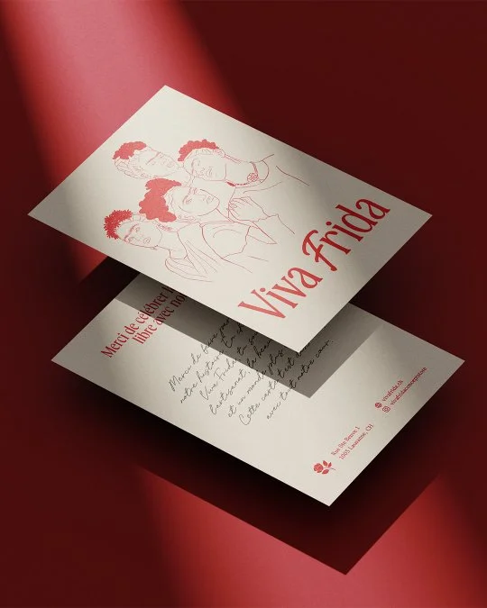
+ Print Collateral (Cards, Tags, Stationery)
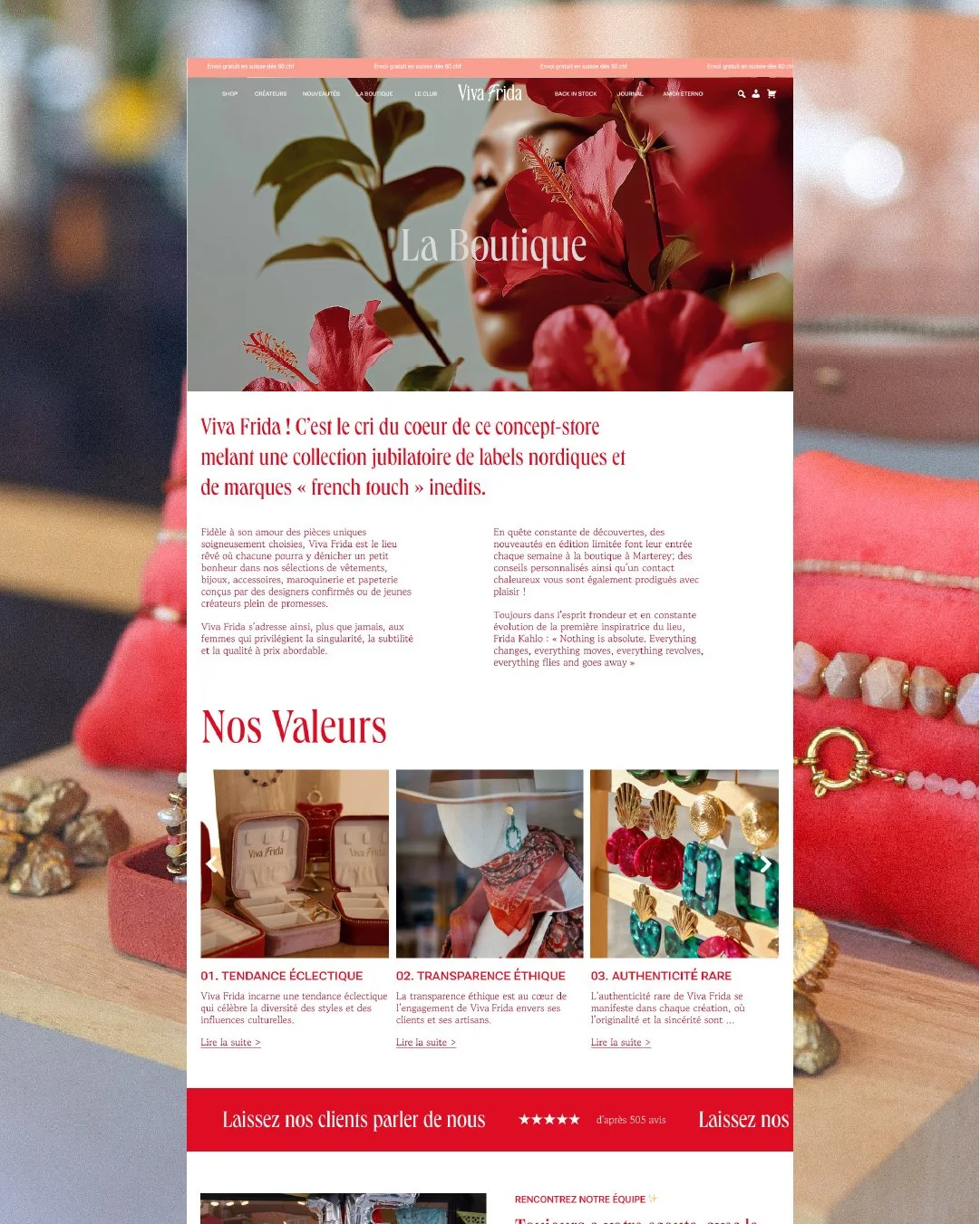
+ Website Design (Squarespace)
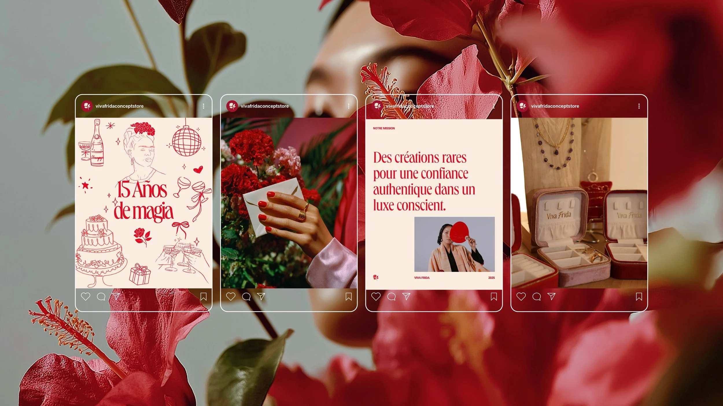
+ Social Media & Campaign Assets
+ Creative Production Guidance
Viva Frida is a Swiss boutique celebrating feminine strength and eclectic beauty.

THE CHALLENGE
How do you reimagine a brand that’s already loved by its community, without losing its essence?
The challenge was to translate Viva Frida’s eclectic and warm spirit into a cohesive, elevated brand experience across every touchpoint. From logo and colour palette to packaging, website, and social media, every detail was considered to reflect authenticity, bold femininity, and artisanal excellence. Inspired by Frida Kahlo, the new identity is rich in colour but rooted in minimal elegance, with hand-drawn motifs, refined typography, and subtle storytelling layers that create an emotional connection.
On the packaging side, we developed a multi-supplier production system combining custom cherry-red jewellery boxes, soft blush pouches, kraft mailers, and branded print materials, all wrapped in surprise, delight, and thoughtful messaging. The website was fully redesigned to feel like an editorial destination, bilingual, intuitive, and immersive, guiding users through the Amor Eterno anniversary collection and the brand’s unique philosophy.
From in-store celebrations to digital experiences, Viva Frida’s rebrand is more than a visual refresh. It’s a love letter to craft, culture, and the women who wear their stories with pride.