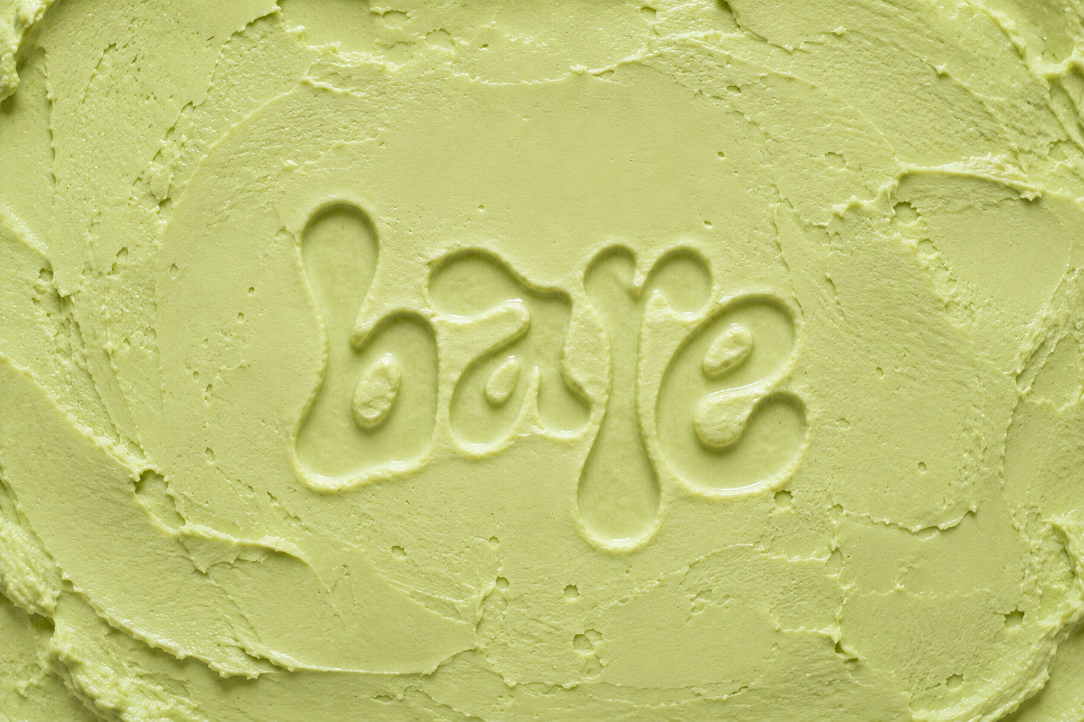
Bare
Healthy Ice Cream Brand & Packaging Concept
Name
BareYear
2026Service Provided
Brand Strategy
Packaging Design
Naming
Creative Direction
Art Direction
Campaign Concept Development
The Story
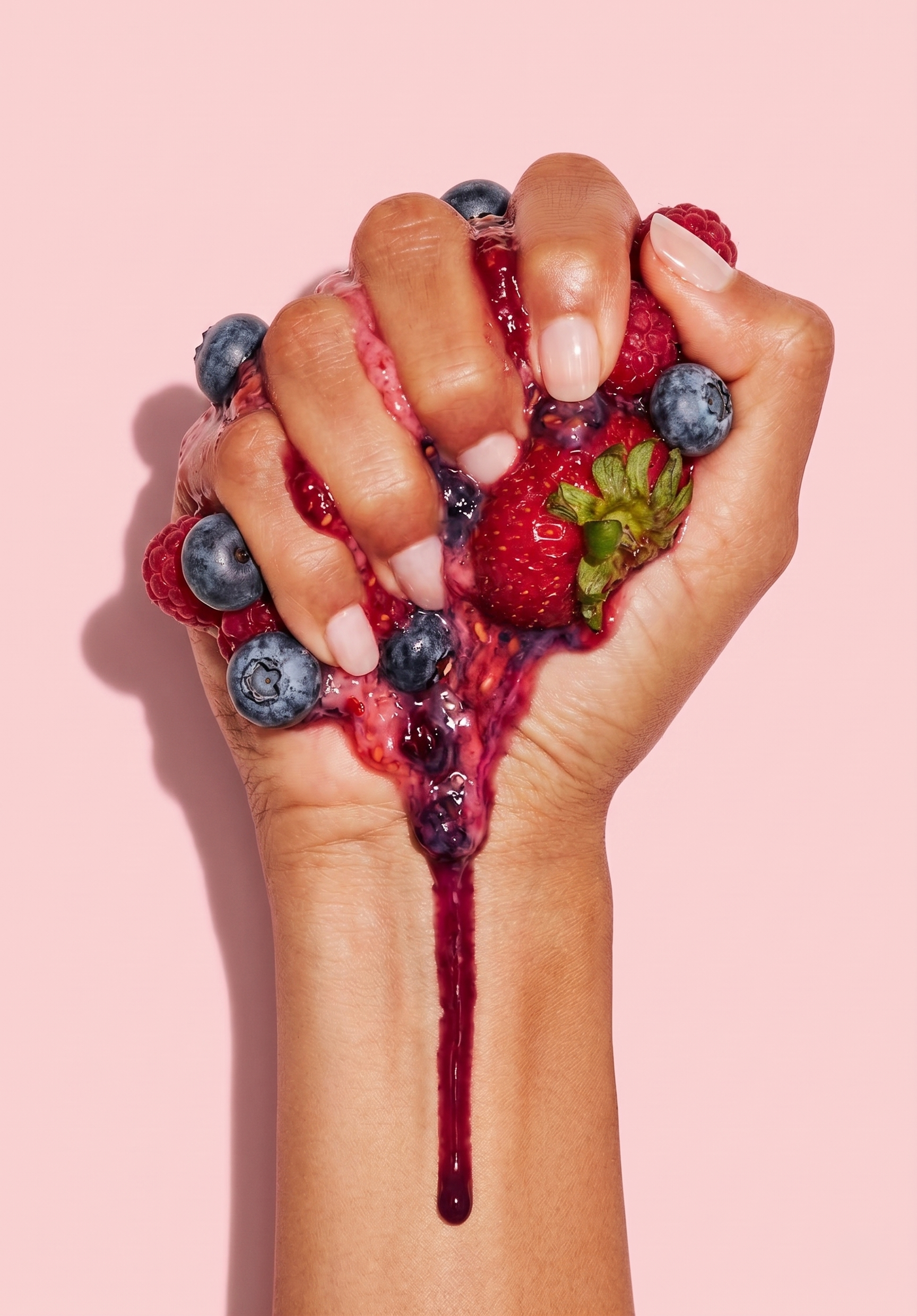
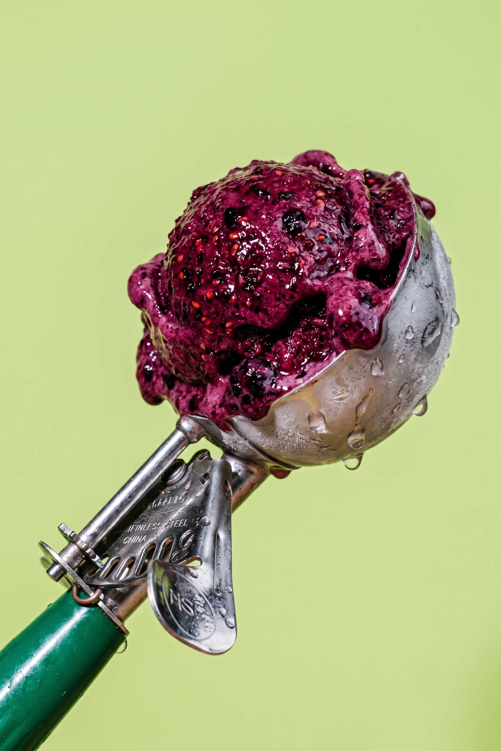
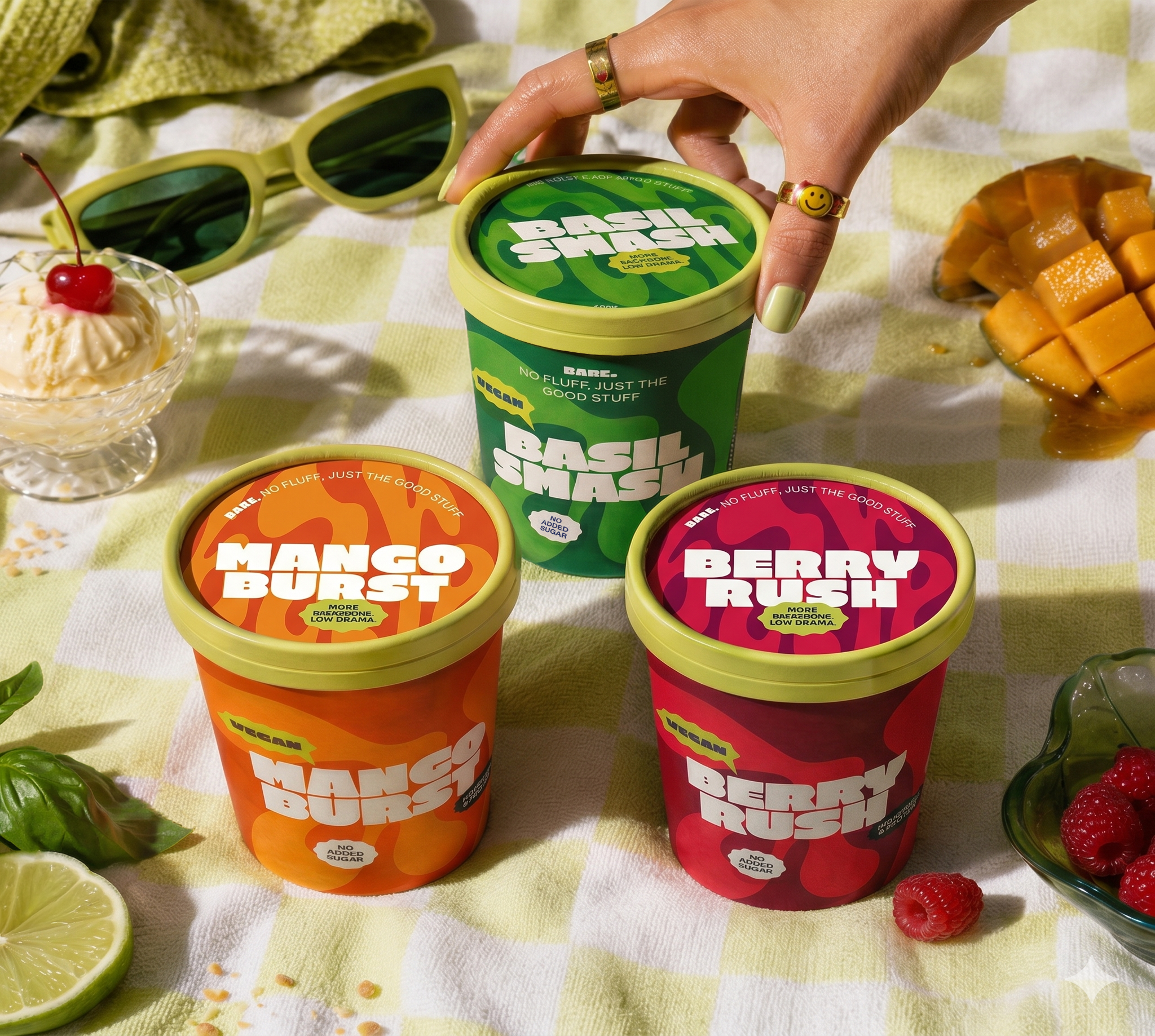
Bare is a contemporary healthy ice cream brand concept created for the Swiss market. The idea was to build a brand for people who want cleaner ingredients and better nutritional value, but without the usual joyless wellness branding, diet-coded messaging, or soft organic clichés.
Instead of leaning into guilt, restriction, or fake-health theatrics, Bare was designed around a much simpler idea: clean ingredients, bold flavour, and no fluff. The brand sits between mainstream functional products and niche artisanal ones, creating a sharper, more culturally relevant alternative in the category.
The result is a brand that feels honest, expressive, and a little rebellious: basically, healthy ice cream with a backbone. As it should be.
Challenge
The challenge was to create a healthy ice cream brand that could stand out in a crowded but oddly predictable market. Competitor research showed that most brands in the category tend to fall into one of three lanes:
functional wellness
artisanal clean-label
retail-organic reassurance
The problem? A lot of them feel either too diet-focused, too niche, or too safe.
The goal with Bare was to find the gap between those worlds and build a brand that felt clean and nutritionally credible, while still being desirable, contemporary, and emotionally engaging. In other words: make something people actually want to buy, not just tolerate because it has fewer calories and a moral superiority complex.
Approach & Outcome
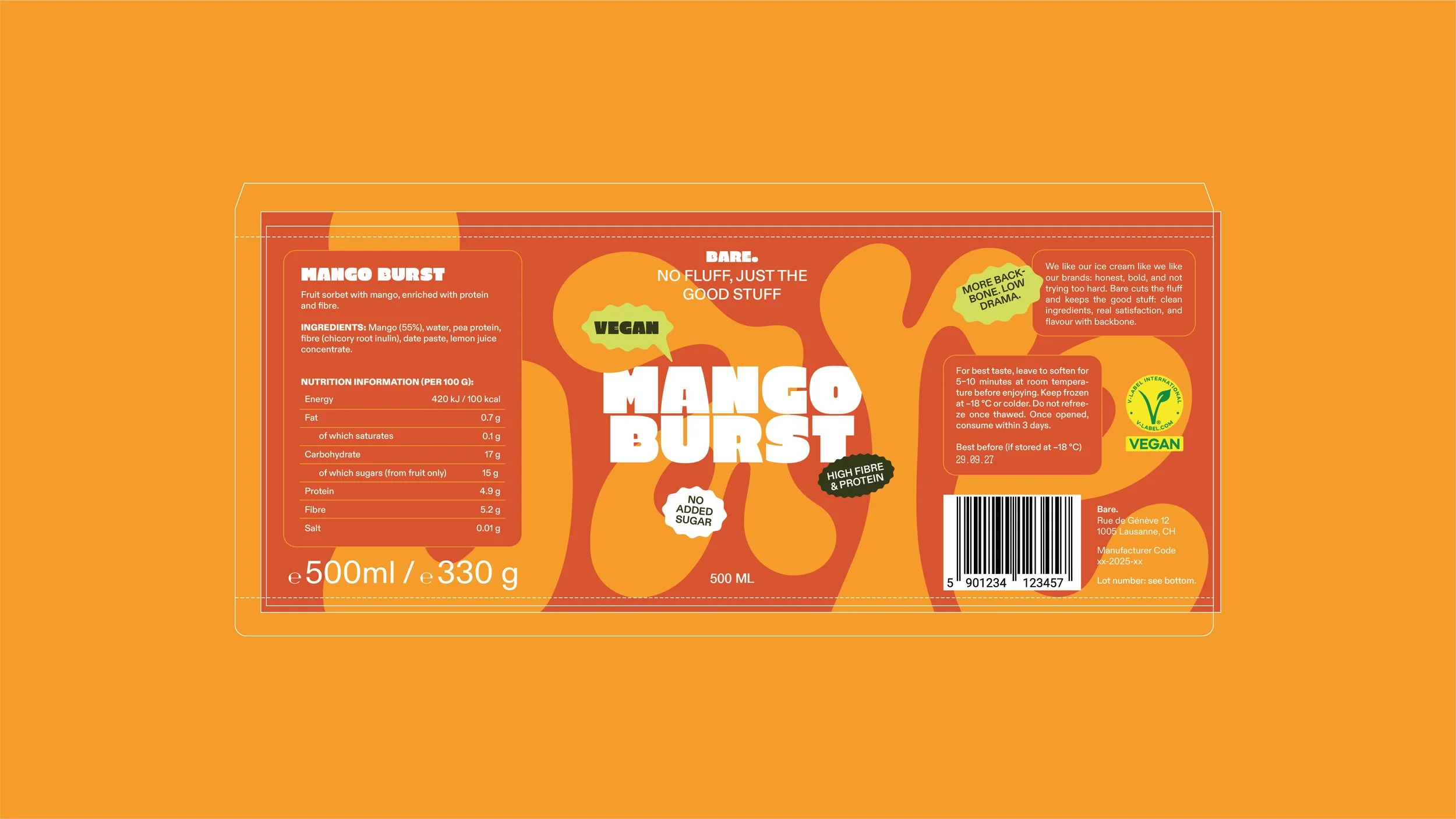
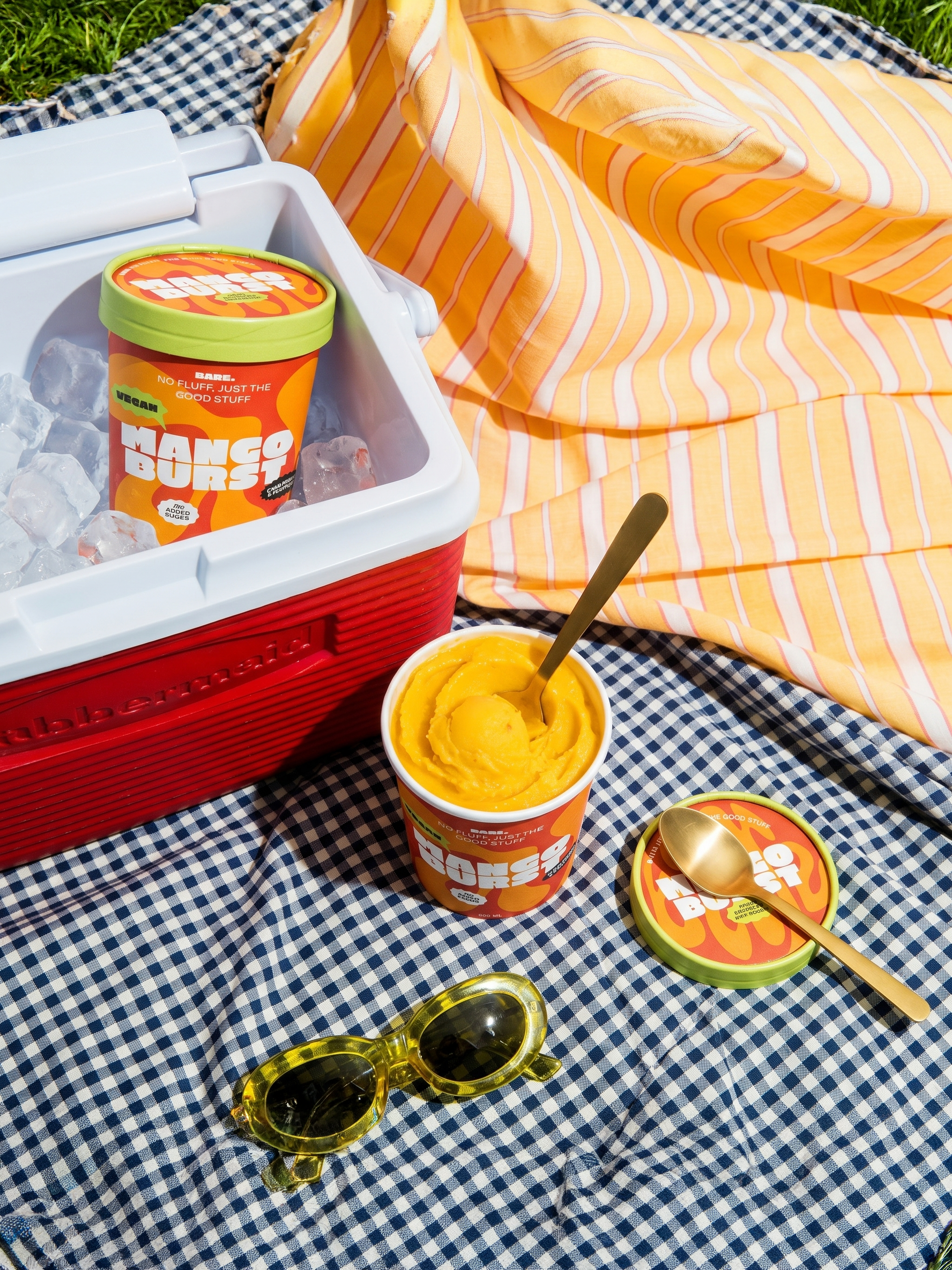
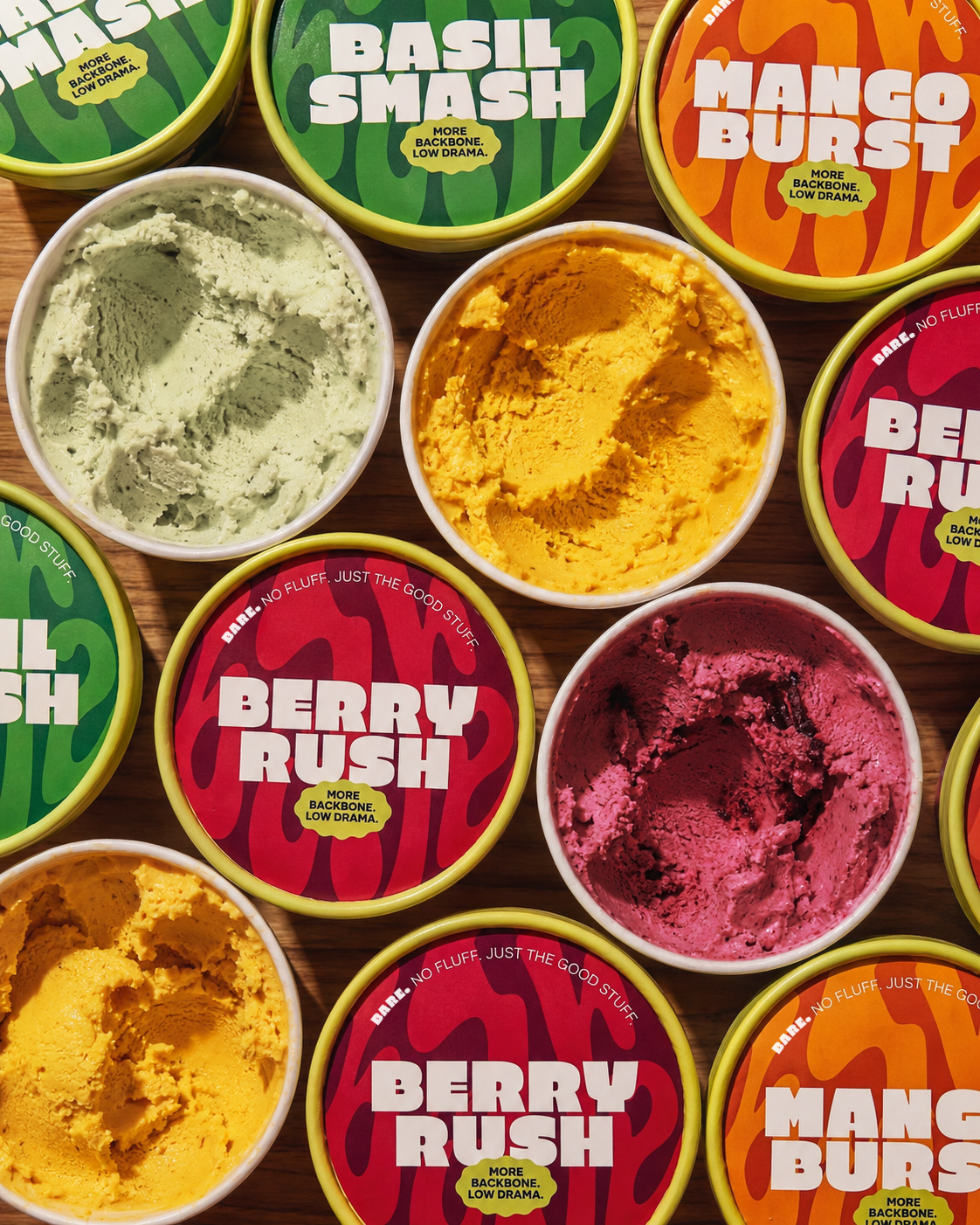
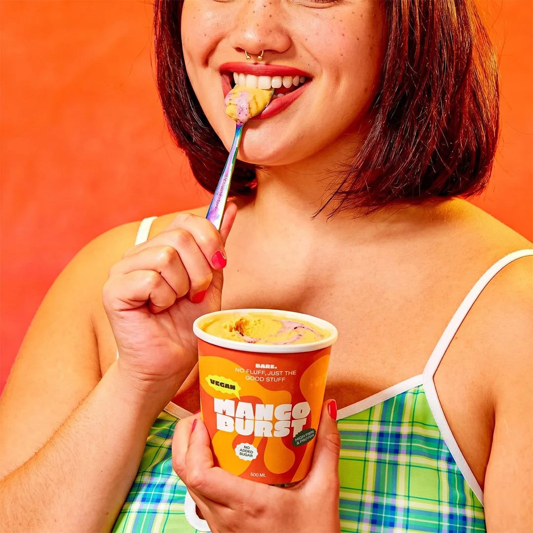
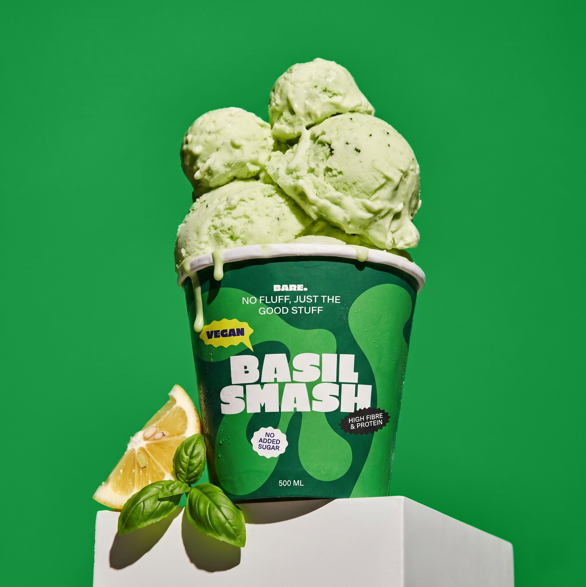
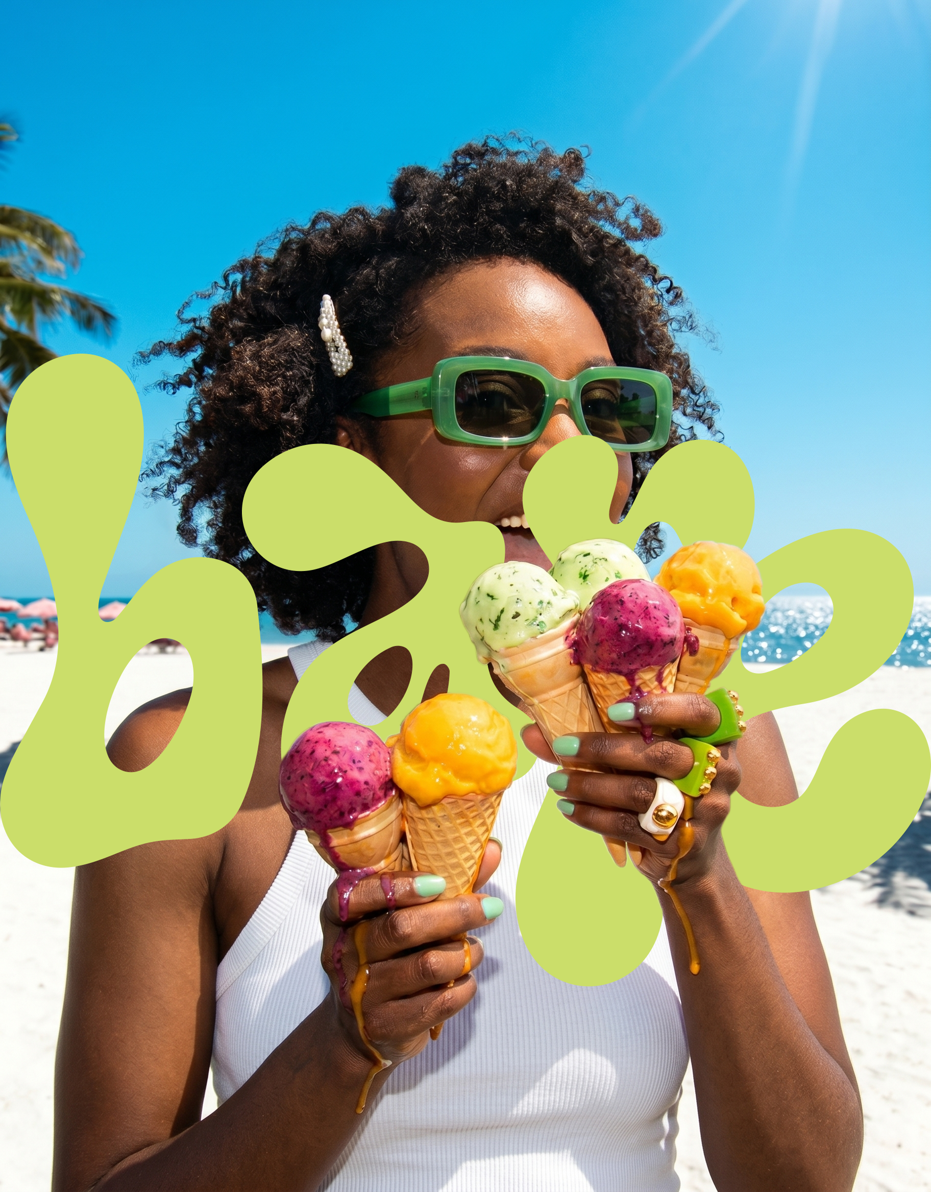
The project began with competitor analysis and strategic positioning, identifying a clear gap in the Swiss healthy ice cream market between functional wellness brands, niche artisanal players, and safe retail-organic products. From there, I developed Bare as a bold, packaging-led brand built around the idea “No fluff. Just the good stuff.” The identity combines clean ingredients and nutritional credibility with a more expressive, contemporary, and slightly rebellious attitude. Through flavour naming, high-contrast colour systems, confident typography, and a deliberately stripped-back material approach, the final outcome became a cohesive brand world spanning tubs, multipack bars, and campaign-ready visual concepts, proving that healthier ice cream can still feel desirable, distinctive, and full of personality.