Viva Frida
Branding, packaging, website and campaign design for a Swiss concept store celebrating artisanal elegance, feminine strength and eclectic beauty.
Name
Viva FridaYear
2024-25Service Provided
Brand Strategy
Art Direction
Visual Identity
Packaging Design
Print Collateral
Website Design
Social Media Assets
Campaign Creative Direction
AI-Assisted Visual Storytelling
The Story
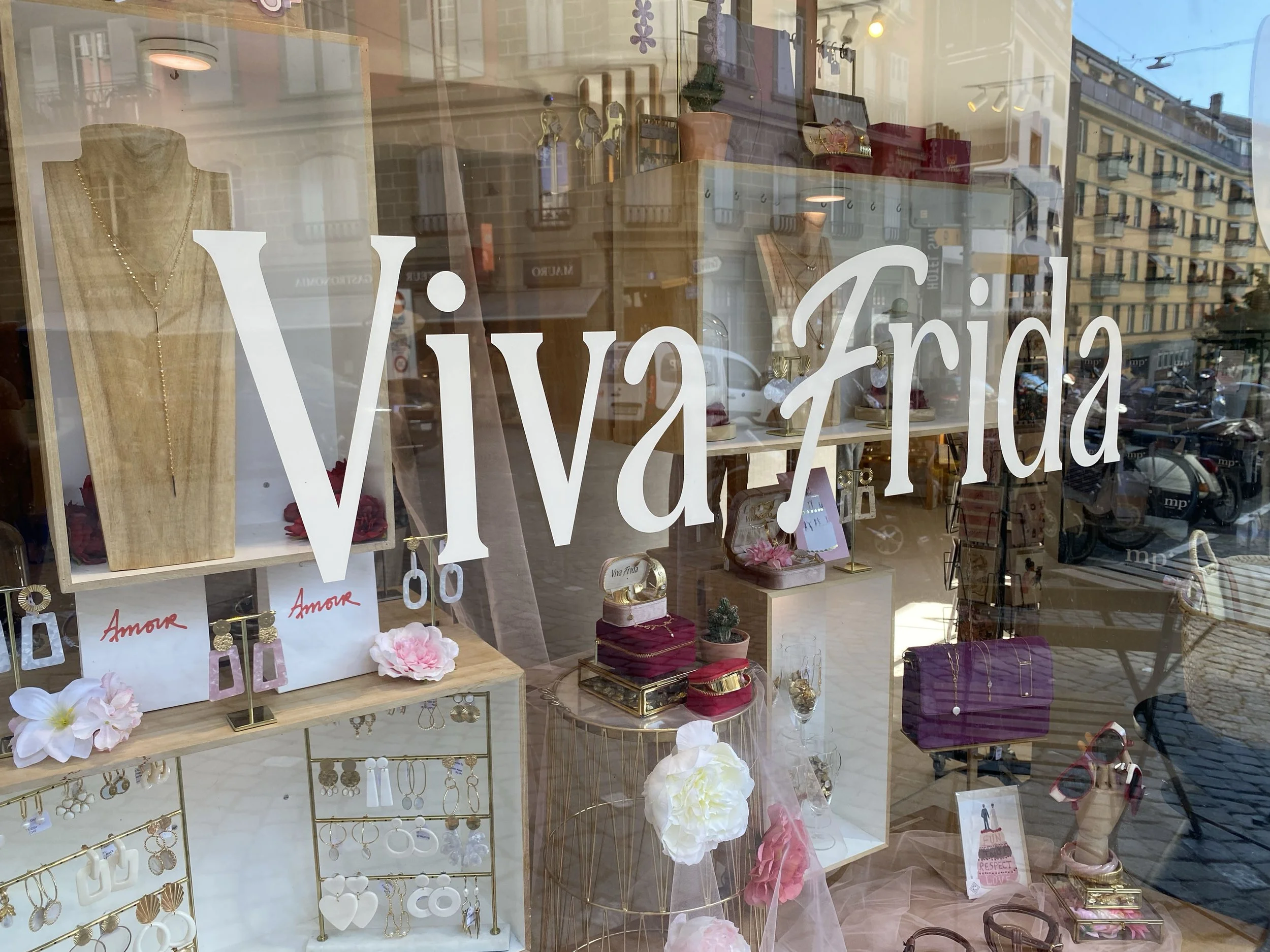
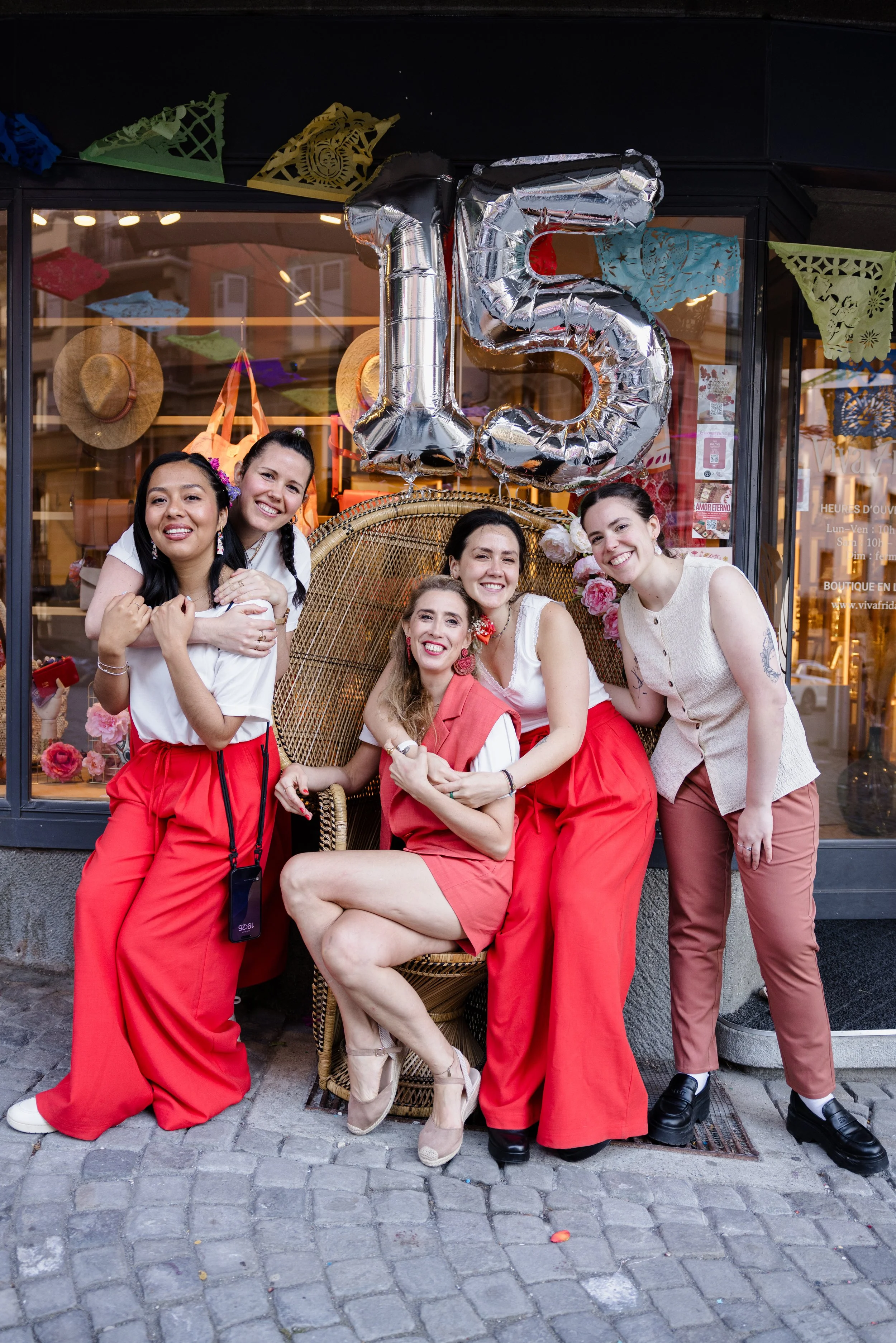
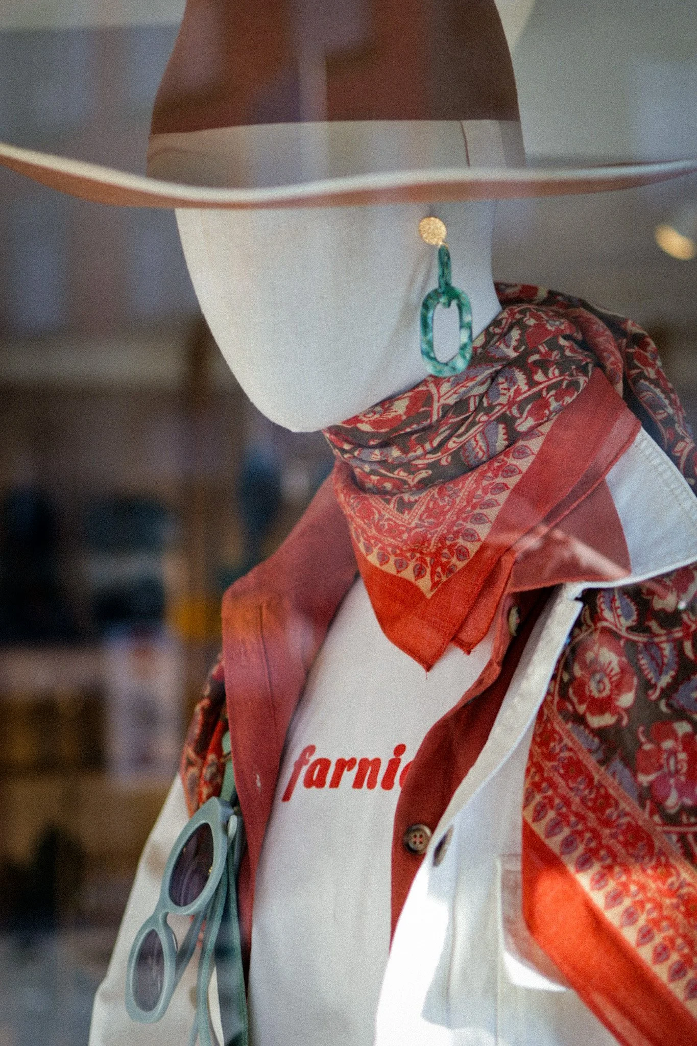
Viva Frida is a Swiss boutique in Lausanne celebrating 15 years of colour, craft and carefully curated treasures. More than a concept store, it is a vibrant world of jewellery, clothing and accessories, created for women who express their individuality with confidence, sensitivity and style.
For its anniversary, Viva Frida needed a full rebrand that could honour its existing soul while opening a new chapter: more refined, more cohesive, more memorable. The goal was to translate the boutique’s Mexican-inspired spirit, artisanal values and warm feminine energy into a complete brand universe, one that feels both elevated and alive.
The new identity was designed around the idea of the femme chic indépendante: strong, conscious, sophisticated, playful and unapologetically unique. A woman who does not follow trends blindly, but chooses pieces that tell a story.
Challenge
The biggest challenge was to rebrand a boutique already loved by its community without losing the emotional connection that made it special in the first place.
Viva Frida had a strong personality, but its visual identity needed more structure, consistency and strategic clarity across all touchpoints: from the logo to the packaging, from the website to social media, from in-store details to the anniversary campaign. The brand needed to feel luxurious without becoming cold, colourful without feeling chaotic, and inspired by Frida Kahlo without becoming too literal or expected.
The packaging system also required a delicate balance between beauty, practicality and production reality. With multiple suppliers involved, each piece had to feel part of the same brand world while remaining feasible, flexible and aligned with the boutique’s budget and needs.
Approach & Outcome
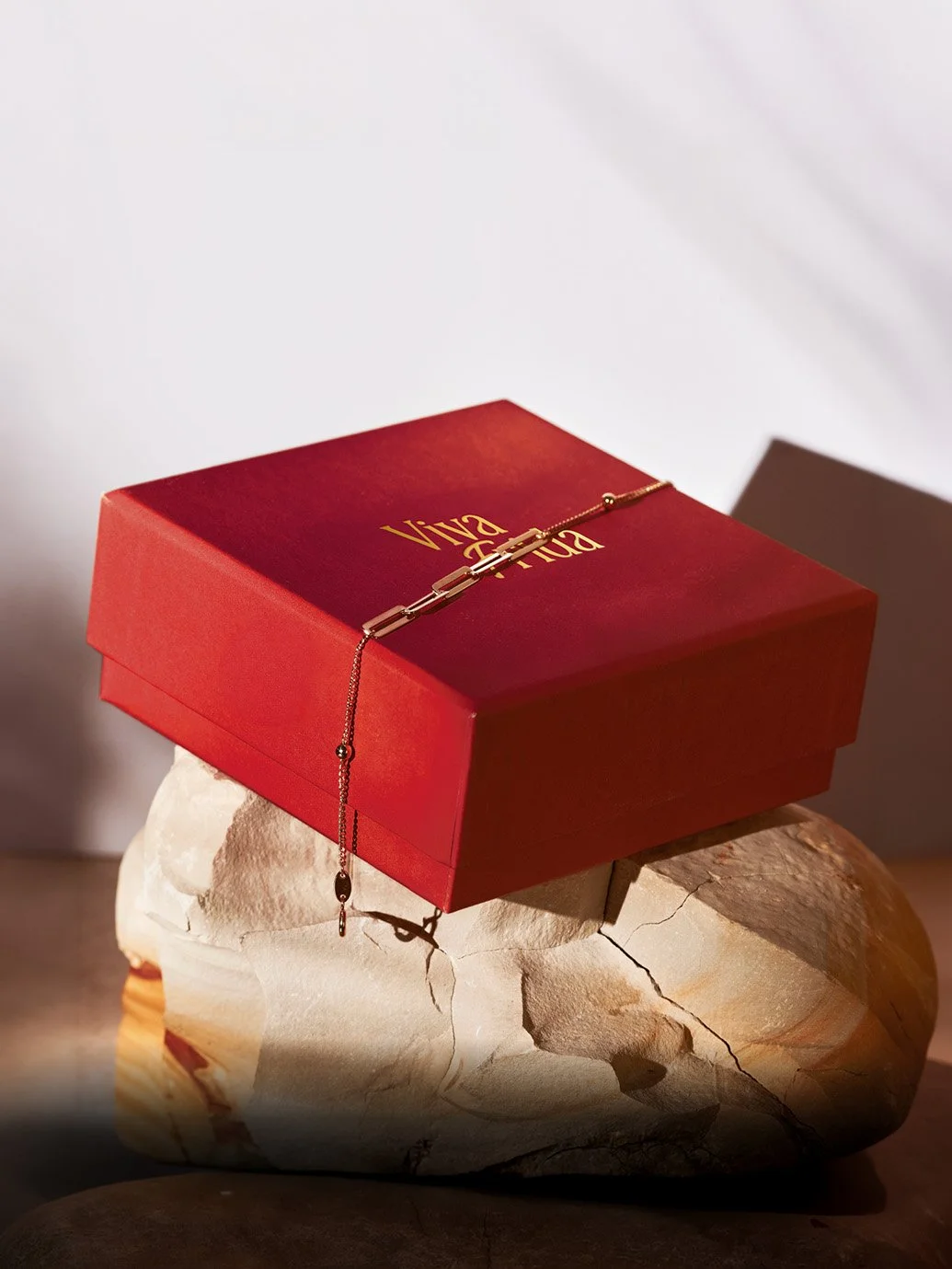
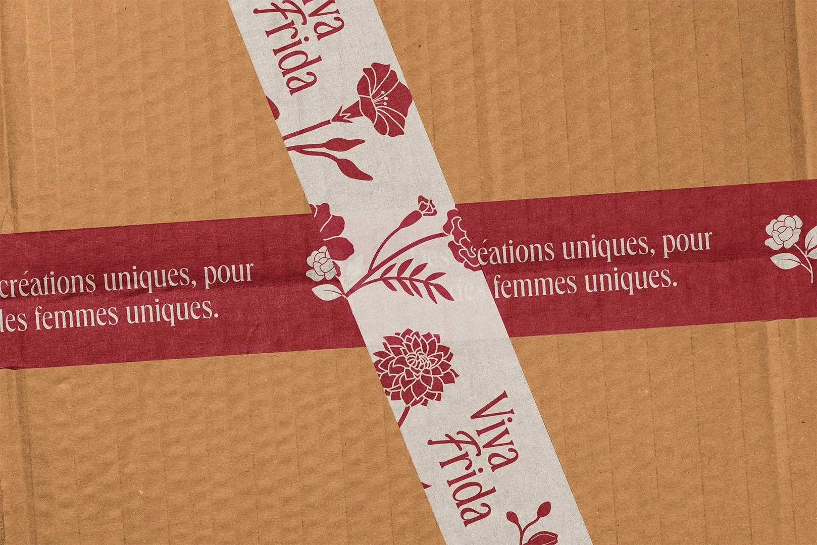
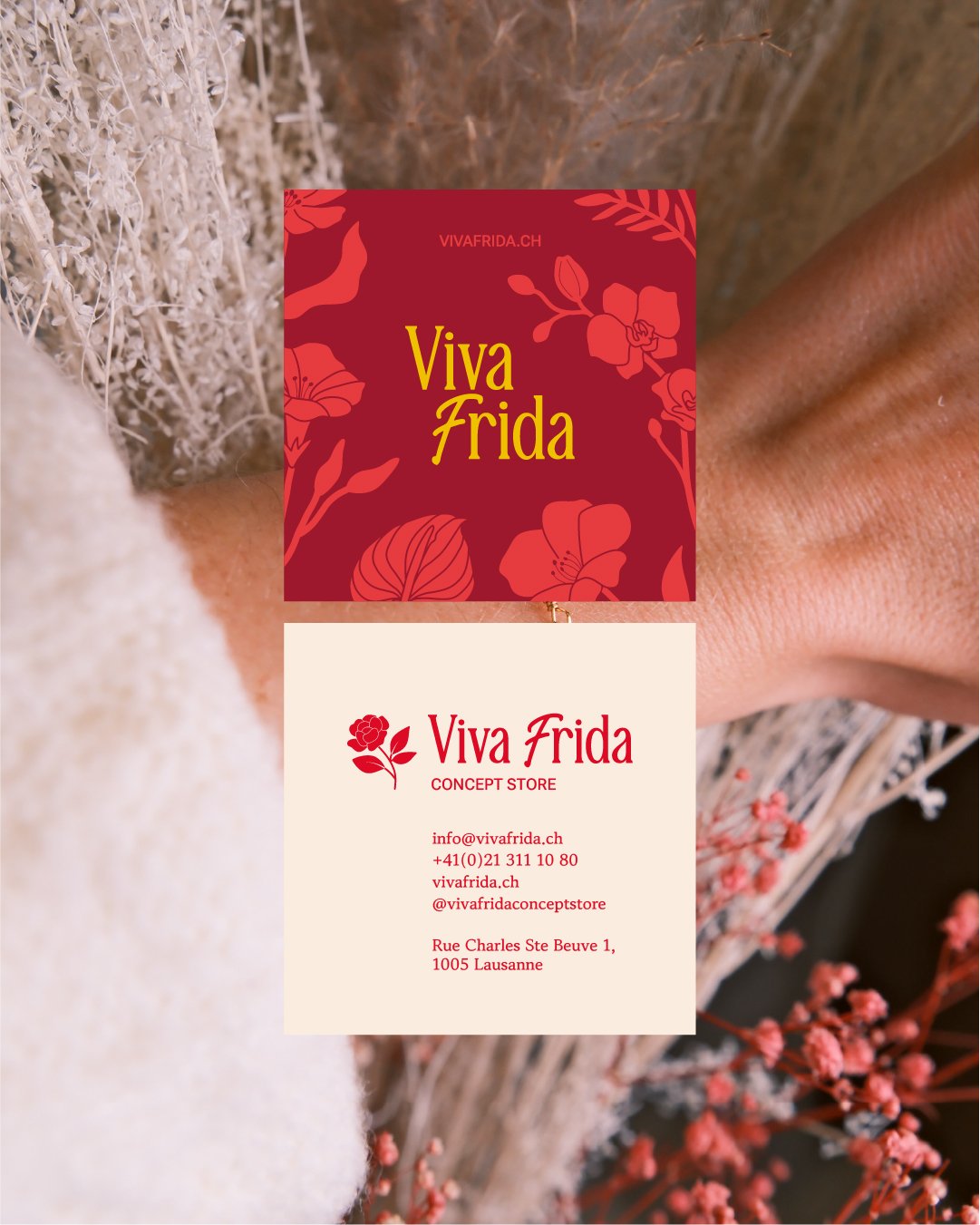
I developed a complete brand identity system rooted in inclusive luxury, artisanal excellence and bold feminine expression. The creative direction blends Mexican folk inspiration with modern editorial elegance: rich colours, refined typography, hand-drawn floral details and a distinctive logo combining a classic serif with a handwritten “f” inspired by Frida Kahlo’s signature.
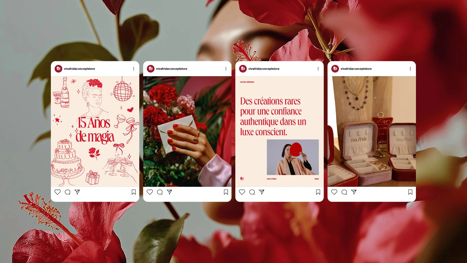
The colour palette was built around Viva Frida’s signature cerise douce, supported by warm, sensual tones such as blush, rouge cerise, framboise and eau de rose. Together, they create a brand atmosphere that feels joyful, sophisticated and instantly recognisable.
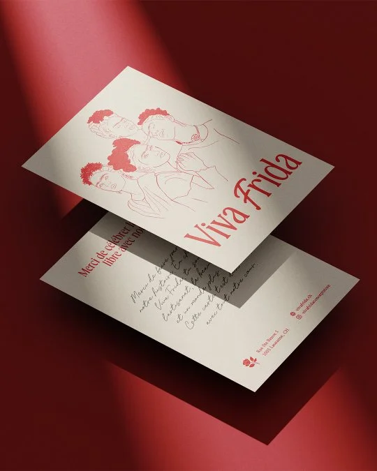
The rebrand was extended into a full packaging and brand experience system, including cherry-red jewellery boxes, blush suede pouches, kraft and red mailer boxes, tissue paper, stickers, branded tape, ribbon, shopping bags, thank you cards, gift cards and return cards. Every detail was designed to create a sense of surprise and delight, turning each purchase into a small ritual: Un trésor t’attend.
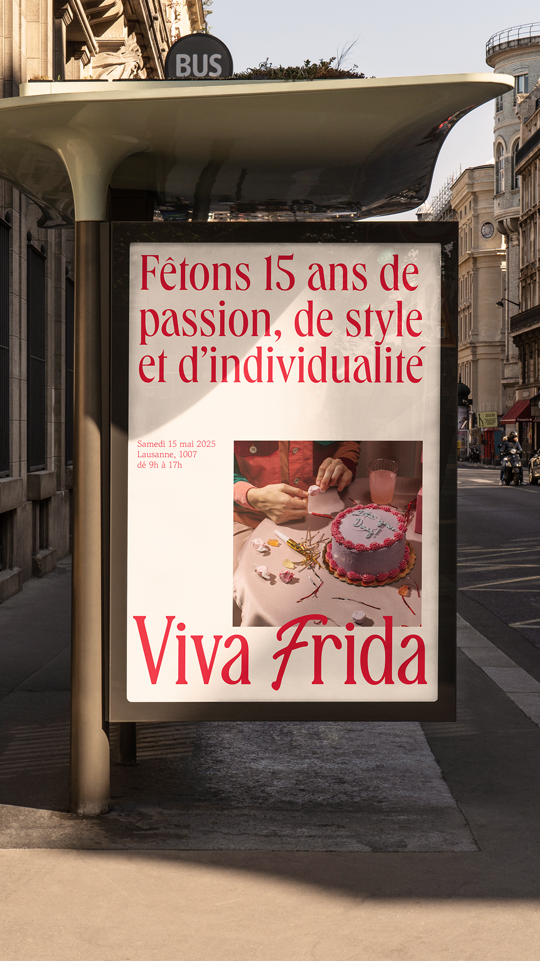
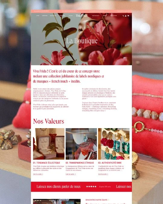
For the digital side, the website was redesigned on Squarespace to feel more immersive, editorial and aligned with the new identity. The visual language also expanded into social media and campaign assets for the 15th anniversary celebration and the Amor Eterno collection, creating a cohesive brand presence across online, offline and in-store moments.
The result is a colourful yet refined brand universe that feels unmistakably Viva Frida: warm, eclectic, feminine and full of soul. A rebrand that does not simply update the visuals, but gives the boutique a stronger voice, a clearer positioning and a more memorable experience at every touchpoint.


Let's build a brand that stands for something real.