Elemen
Brand strategy, visual identity and packaging design for a modern men’s essential oil brand.
Name
ElemenYear
2022Service Provided
Brand Strategy
Visual Identity
Packaging Design
Creative Direction
Art Direction
Social Media Design
Photography Direction
Brand Collateral Design
The Story
Elemen is a natural wellness brand created to make essential oils more accessible, relevant, and appealing to modern men.
While the wellness industry has grown rapidly, much of its visual language still tends to feel feminine, spiritual, or disconnected from how many men approach self-care. Elemen was developed to challenge that perception, offering a curated collection of sophisticated essential oil blends designed around recognisable, everyday needs, from sleep and stress relief to exercise recovery, headaches, hangovers, and foot care.
The goal was not to make wellness feel more masculine through predictable clichés. It was to create a brand that felt confident, refined, practical, and easy to understand, giving men a natural way to care for themselves without making the experience feel intimidating or overly complicated.
The result is a contemporary men’s wellness brand that positions essential oils as useful, credible, and naturally integrated into everyday life.
Challenge
The challenge was to introduce essential oils to an audience that may not traditionally see the category as relevant to them.
Competitor research revealed that much of the essential oil and natural wellness market relies on similar visual codes: soft colour palettes, botanical illustrations, spiritual language, and highly feminine lifestyle imagery. While these conventions are familiar within the category, they risk excluding customers who are interested in natural wellness but do not identify with its traditional presentation.
Elemen needed to feel unmistakably different without falling into exaggerated masculinity, dark-and-rugged stereotypes, or generic men’s grooming aesthetics.
The brand also needed to communicate the purpose of each blend quickly and clearly. With products supporting needs such as sleep, recovery, stress, headaches, and hangovers, the packaging system had to make the collection intuitive to navigate while maintaining a strong and cohesive visual identity.
The goal was to build a men’s essential oil brand that felt sophisticated but approachable, natural but contemporary, and masculine without becoming clichéd.
Approach & Outcome
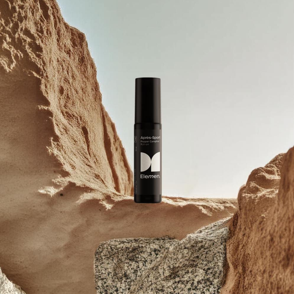
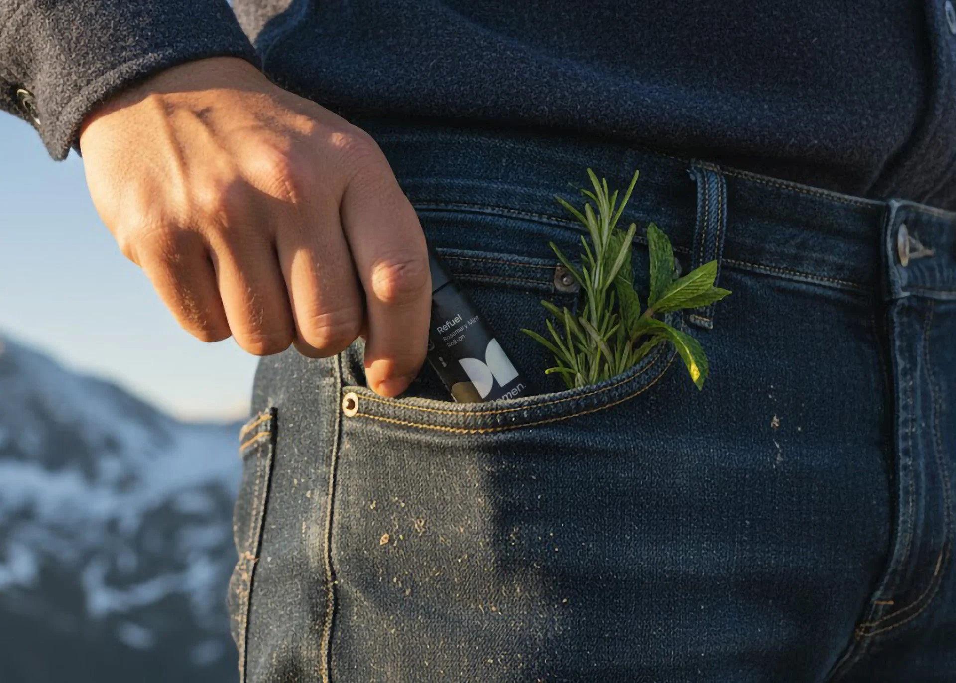
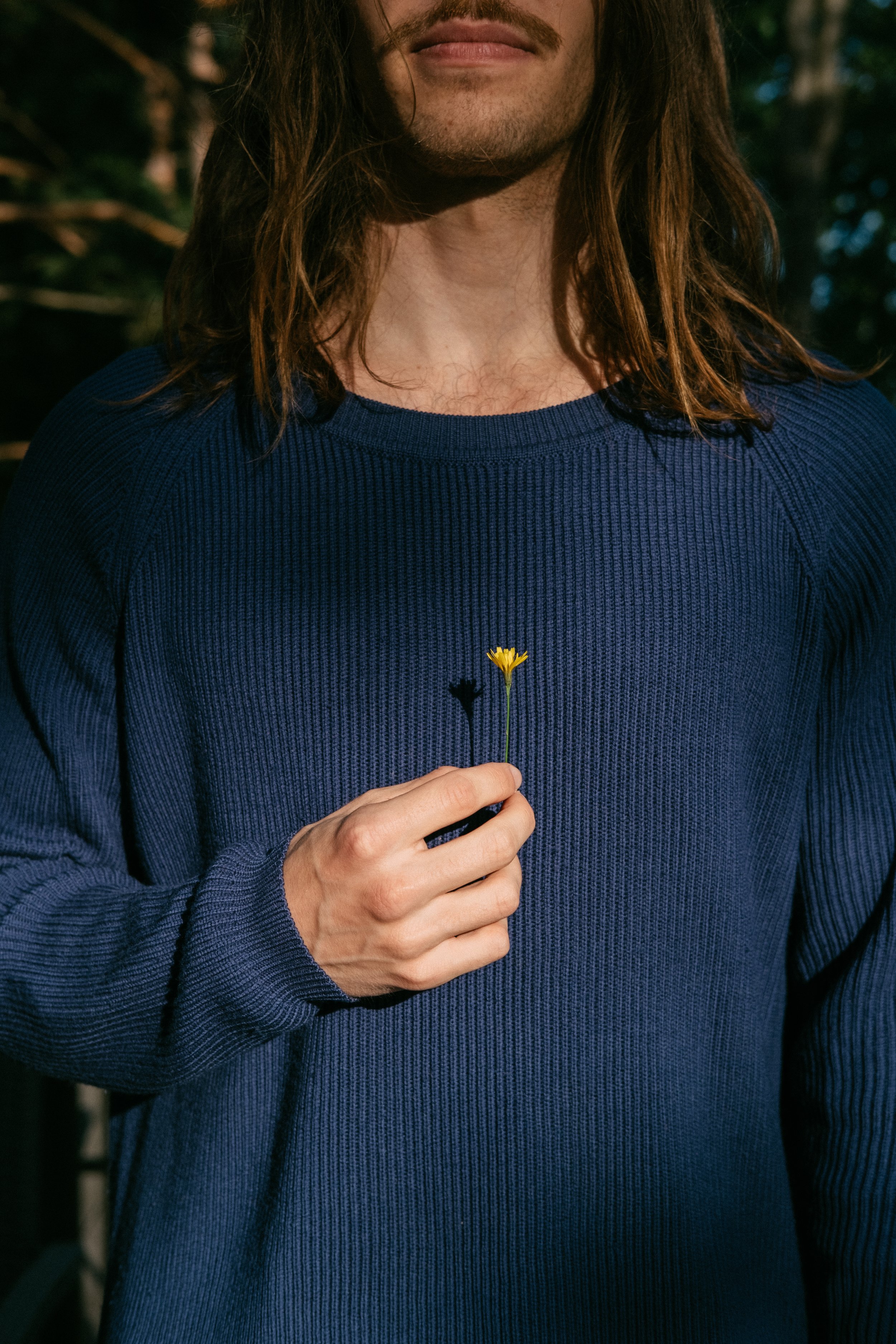
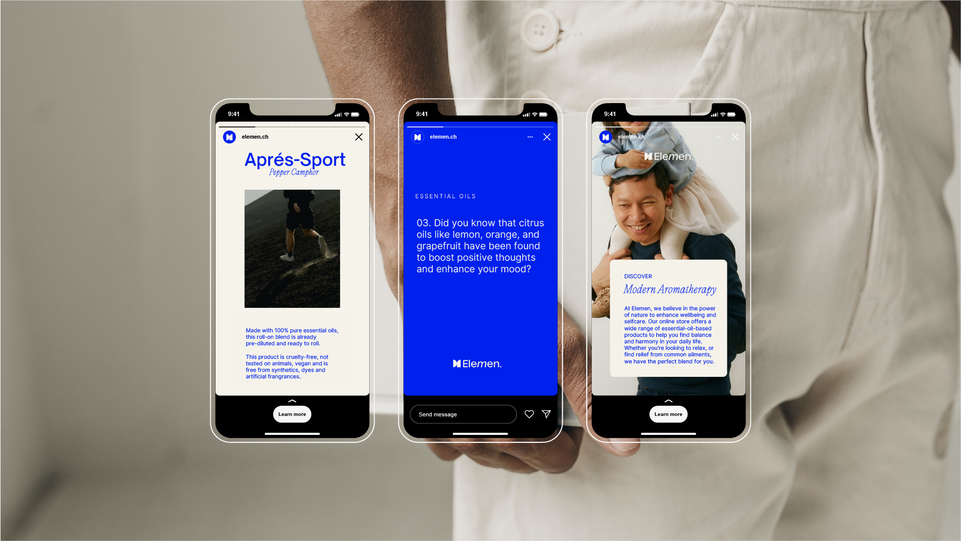
The project began by defining a clear strategic position for Elemen within the men’s wellness and essential oil market. Rather than adapting traditional wellness branding with darker colours or more masculine imagery, I created a distinctive brand world rooted in confidence, clarity, practicality, and modern self-care. The visual identity combines bold typography, a recognisable monogram, a refined blue-led colour palette, and carefully directed lifestyle imagery that balances outdoor energy with quiet, everyday wellness moments. The packaging system was designed to make each essential oil blend easy to identify while keeping the collection cohesive across roll-on bottles, labels, boxes, and supporting brand materials. Product names such as “The Athlete” give each blend a clear personality and purpose, helping customers immediately understand where the product fits into their lives. The final identity extends naturally into social media templates, educational content, photography, and campaign-ready visuals, giving Elemen a flexible and memorable foundation from which to grow. The result is a men’s wellness brand that makes essential oils feel credible, desirable, and refreshingly uncomplicated.



Let's build a brand that stands for something real.